
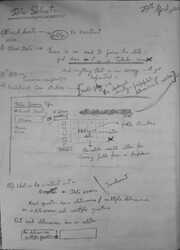
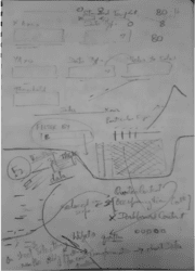
30th August - ....
4th phase of development
- Add more charts from VisX specially Pie & Donut charts.
- Integrating Chart customizations to in-House charts.
- YouTube videos for documentation & follow along, and add them on the Docs page.
- Code up Scatter Chart, and also pick it from the other chart providers.


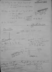
23rd Aug - 29th Aug
Focus would be save user progress on the platform, this being an only UI application. Also to allow users to share their workspaces with other users.
- Download workspace, with / without data & encryption, as an external file.
- Saving Workspaces to local inBrowser Database with Dexie.
- Loading Workspace from an external file, via Load Workspace button.
- Loading inBrowser state on browser refresh.
- Implement WebCrypto API for encryption.
- Footer with Privacy policy.
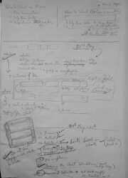
9th Aug - 20th Aug
Making the product more usable, with FAQs & Feedback.
- Rewrite Chart transformation logic, to make it more robust and intuitive.
- Testing out the BarChart with all types of mapping with sample data, Person Health Data, Student Data Categorical & Numerical, Employee Data & Hawa Automobiles.
- Enhance the Datasources page to add a Summary section. This provides the ability to run basic exploratory analysis on the data.
- Adding error boundaries on the Chart.
- Add a feedback system via Airtable.
- Add FAQ on landing page.
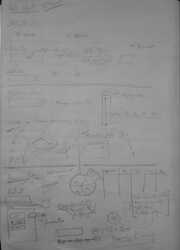
28th July - 5th August
Third phase of development. I am looking to integrate more charting libraries apart from Recharts.
Add more Chart providers, and let the users pick them for Dashboards under workspaces. The user could have a mix-match dashboard, from multiple providers.


11th July - 28th July
Time for a Prod build - Phase 1. Add more stability to the application, along with load time optimizations.
- Adding a validation service for field validation based on mapping type.
- Adding Raw Data @Datasource level, with the ability to see the fields in every object, and all the unique values.
- Update the parsing code to include Raw & Table data.
- Update the Rows & Column selectors for Table & Raw data type, to be multi-select instead of plain input boxes.
- Adding Horizontal Bar & Stacked Area charts for selection in Workspaces.
- Ability to take snapshot of a Dashboard.
- Running a Production build, with Lazy routes & component loading on user actions.
- Add a Timeline component.
The load time has been reduced from 20 secs to 6 secs on a Fast 3G Network, with a total of 4.2Mb transferred over the network, for all requests across the application. Overall, the application has come up fine, but more work needs to be done.
28th June - 8th July
With the workspaces done, I now realize, it is more involved. So what about a Quick one. Time to integrate Quick Create from Phase 1.
- Add a Quick Create option
- Ability to add Tabular data, with two columns, one being the X and the other being the Y Axis.
- Integrate React Ace Editor for Raw data processing. Raw data allows for valid JSON, and the user can choose a single X axis and multiple Y Axis variables.
- Integrate Recharts to show up quick charts
- Integrate settings to customize the look and functionality of the individual charts
27th April - 27th June
Workspaces. Yes, workspaces should be the answer to all of the problems. A Workspace would be the logical separation, wherein each of these would have their Datasources, Questions & Dashboards. Each of these sections would further have a List & Edit area.
- Create a landing page for Workspace.
- Create a List view for Datsources, Questions & Dashboards
- Create a add section for Datasources
- Add Table & Raw data selectors for Datasources
- Create a add/edit section for Question.
- Create an add section for Dashboard
- Add more documentation, with the ability to try out sample data for all four mapping types.
- Integrate React Grid for a more customizable & resizable dashboard.
- Each question now exposes a flag, to include it in the Dashboard.
- Add Sunburst Pie, Hierarchy & Table Charts to the mix.
- Enhance the Categorical & the Numerical value selectors.
11th April - 25th April
I have been thinking on the things to add, a better UI, which would allow for more breathing space, stabilize the UI a bit, and make the application a bit more dynamic, with the ability to select multiple types of data. The switch from Angular to React is coming up fine.


20th March - 5th April
I have identified four different types of mappings. MCMR, SCMR, SCSC, SCMC, where M - Multiple, S - Single, C - Column and R - Row. With this, the user would be able to explicitly mention the mapping.
- Divide the parsing based on Mapping.
- Add Documentation to let the user understand the mapping & the selection format
- Add a Category selector, which should allow for value selections, merge & omit.
- Change the name from Occupancy@Work to ChartAwesome, with a different logo.
- Change the questions view to a more accordion style, where in each question opens up to reveal the selectors, have a Parse button, which would then reveal the selected data & the corresponding chart.
The application, still works only on Excel, has a hardcoded unmovable dashboard & a lot more work needs to be done on the charts.
13 - 20th March
The dashboard is done, with a hardcoded excel sheet. But it's time to make it more generic. Users should be able to choose a set of columns, & the data type, rows, be able to add Questions, add thresholds, even select the type of chart.
- Create a Question Editor, with the ability to view, add, delete questions.
- Create a selection component for each question, to select rows, columns, data types etc.
- Define a Column and Row selection format.
- Write a parser, to read the data from the Excel.
- Write transformation functions to convert the data read into the format required for the charts
- Add a Chart selector dropdown
Still focussing on Excel sheets. However simple selections are not working out, since I can select multiple columns for Y axis, at which point i need to created Grouped Stacked Bar charts, which is turning out cumbersome.
3rd - 12th March
Taking a tangent here. @Office, they are planning to open up, and have created a Back to Office plan, but then there is the 40% Occupancy threshold. So the idea is to ask beforehand, who's coming on which day, & its all in an excel sheet. So i am thinking i will just build a UI, that reads this excel sheet, and generates a couple of charts.
I have decided to choose React 17 for this.
- Set up a React project using CRA
- Read the Excel sheet, hardcoding the columns & rows that hold the data
- Integrating D3 with React
- Create Bar, Pie & Sunburst charts
- Arrange them all together to create a Dashboard type feel.
I have been reading up on React, over the past couple fof months, and i like the lightness of the framework. Also its time to try something new. Been on Angualar for 5 years now. I think Hooks, Context API & the Functional components, will make the development experience better.
... - 3rd March, 2021
Probably this project will also end up like other of my ideas. In GitHub, but never deployed.
Having built the initial layout, there are more things that need to be added. But i lack the general direction, and work has been hectic lately, so unable to find time.
12th Dec, 2020 - 30th December, 2020
I have started working on the concept. The idea is to create a Quick Data visualizer, wherein the user enters some data, and is able to visualize it in a simple chart, which also offers a couple of customizations.
I have decided to choose Angular 11 for the project.
- Created the initial project component hierarchy.
- Add Angular Material to the project
- Find cool chart icons.
- Add angular components to create bar, line, area, pie & donut chart
- Add ability to change color
- Implement file upload functionality
- Adding resizeObserver for tracking changes to the view Area
- Add Table view for the data
- Convert json data into flatdata
- Map complex JSON data into a Form
I got the chart icons from the Shutterstock 10-free-stock-images.